Siete
Siete’s store locator is a new shopping and locator experience that gives customers an easier way to discover products so that they can shop their favorites with the most up-to-date data
Overview
Siete is a fast-growing consumer packaged goods (CPG) company known for its healthy, grain-free food products. With a surge in online traffic, the team identified an opportunity to improve its store locator tool—one of the most-visited pages on their e-commerce site.
The existing experience, powered by a third-party vendor, was causing friction due to outdated product availability, lack of specificity, and limited data customization. I was brought in to lead the UX research and product design efforts to create a custom-built store locator that would better support Siete’s users and internal teams.
Challenge
Siete faced a choice: continue using a limited third-party locator for another year or invest in building a tailored in-house solution.
The existing tool presented several user pain points:
• Inaccurate store data, leading to customer frustration
• No product-specific search, making it difficult to find desired items
• Lack of brand visibility and control over store and product listings
The team opted to design a bespoke store locator that would:
• Improve data accuracy and freshness
• Enable product-level search
• Reduce reliance on customer support
• Increase customer satisfaction and trust
Goal
Create a user-friendly and efficient store locator that supports Siete’s core customers—The True Believer and The Enlightened Environmentalist—with accurate, actionable product data, while reducing bounce rates and support inquiries.
Research & Discovery
User Personas
Using insights developed by Naturalink (via Spins & IRI panel and POS data), we focused on two key persona types:
• True Believer: Health-conscious, mission-aligned, loyal to values
• Enlightened Environmentalist: Curious, values sustainability, prefers natural retailers
Competitive Benchmarking
I reviewed store locator experiences from brands like Starbucks, Impossible Foods, and Google Maps. Key insights included:
• The importance of filter flexibility (e.g. Starbucks’ product filters)
• The value of brand logos and visuals to build recognition
• UI cues that support scanning vs. reading
Data & Success Metrics
With our PM, I leveraged Google Analytics to define and track success:
• Bounce Rate
• Unique Page Views
• Time Spent on Page
• Click-Through Rate
• Page Rank
Design Process
Sketching & Ideation
I began by sketching a wide range of ideas to explore layout, filtering, and product discovery patterns. Working in a lean team allowed for rapid feedback loops—our brainstorms included the PM, content designer, and engineer to align on priorities early.
Low-Fidelity Wireframes
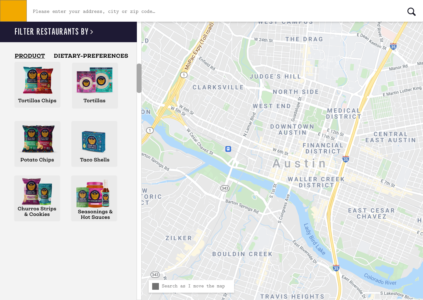
After narrowing concepts, I developed low-fidelity wireframes that prioritized:
• Clear product filtering
• Store location mapping
• Visible stock information
High-Fidelity Designs
Final designs included:
• Product filters
• Store logos (to reduce user confusion)
• Clear CTAs and links to product pages
• (Planned) Aisle info for future iteration
Due to MVP constraints, aisle info was excluded in the first release but flagged for future development.
Outcome
While success metrics were still being tracked post-launch, early signals included:
• 25% Reduced customer complaints to the Delight team
• 63% Increased product-specific search usage
• Positive internal feedback on usability and control over content
The custom store locator gave Siete ownership over a critical user touchpoint, improved trust in product availability, and laid the groundwork for scalable future enhancements.